Role
UX Designer, Project Manager, UX Researcher

Context
Masters in HCI Capstone Project
Timeline
April - September 2023
Team
6 Masters in HCI students
Tech stack
Figma, Figjam, Qualtrics, Maze, Dovetail
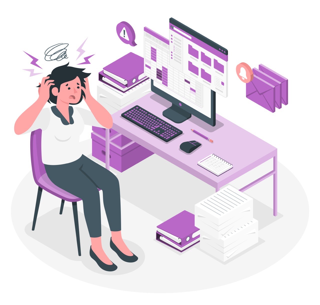
Problem
Prospective students and their parents frequently made errors on the online application form to Orange County School of the Arts (OCSA) due to unclear instructions and critical information buried in external PDFs.
Users described the entire admissions process as stressful and time-consuming, with 60% needing to contact OCSA for help during the 2022-2023 application cycle.
Before


Solution
Transformed a complex form into a Wizard experience customized to each user.
Increased information delivery while maintaining simplicity.
Improved visual and content design to be more friendly and accessible.
After

Final outcomes
Business impact
Orange County School of the Arts (OCSA), is a charter school for 7th-12th graders that provides a world class arts education.
Over 60% of applicants contacted OCSA via email or phone for help with the online application in 2022. Reducing this number would streamline operations, allowing staff to focus on strategic priorities.
The users: different types of applicants
Parents of middle school and highschool aged children
Parents who are very invested in their child’s overall development and success in the arts
Hghschool aged children who complete the application mostly independently
Parents and children who team up to complete the application
My contributions and process
Learn more about my design process below ⬇️
User research methods
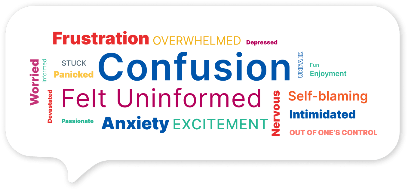
OCSA stakeholders connected us with parents of about 200 current students. We created a survey on Qualtrics that got 165 responses, then conducted 10 user interviews as well as heuristic evaluation and competitive analysis. We uncovered the following key insights about OCSA’s admissions process.
Research insights
🧐
😰
📞

Two user personas due to poor information delivery

Ideation: "Wizard" design requirements to make important info easy to find
Knowing that users would only be interacting with this form once a year at most, we focused on lowering the cognitive load as much as possible. This led us to the idea of making the form resemble a Wizard, or guided walkthrough, which would have the following design requirements:
Continuously adapt tasks and instructions based on user selections to reduce overwhelm.
Inform the user by explaining each application requirement, when relevant, directly in the application interface.
Implement descriptive breadcrumbs and confirmation messages so that users can see where they are in the process.

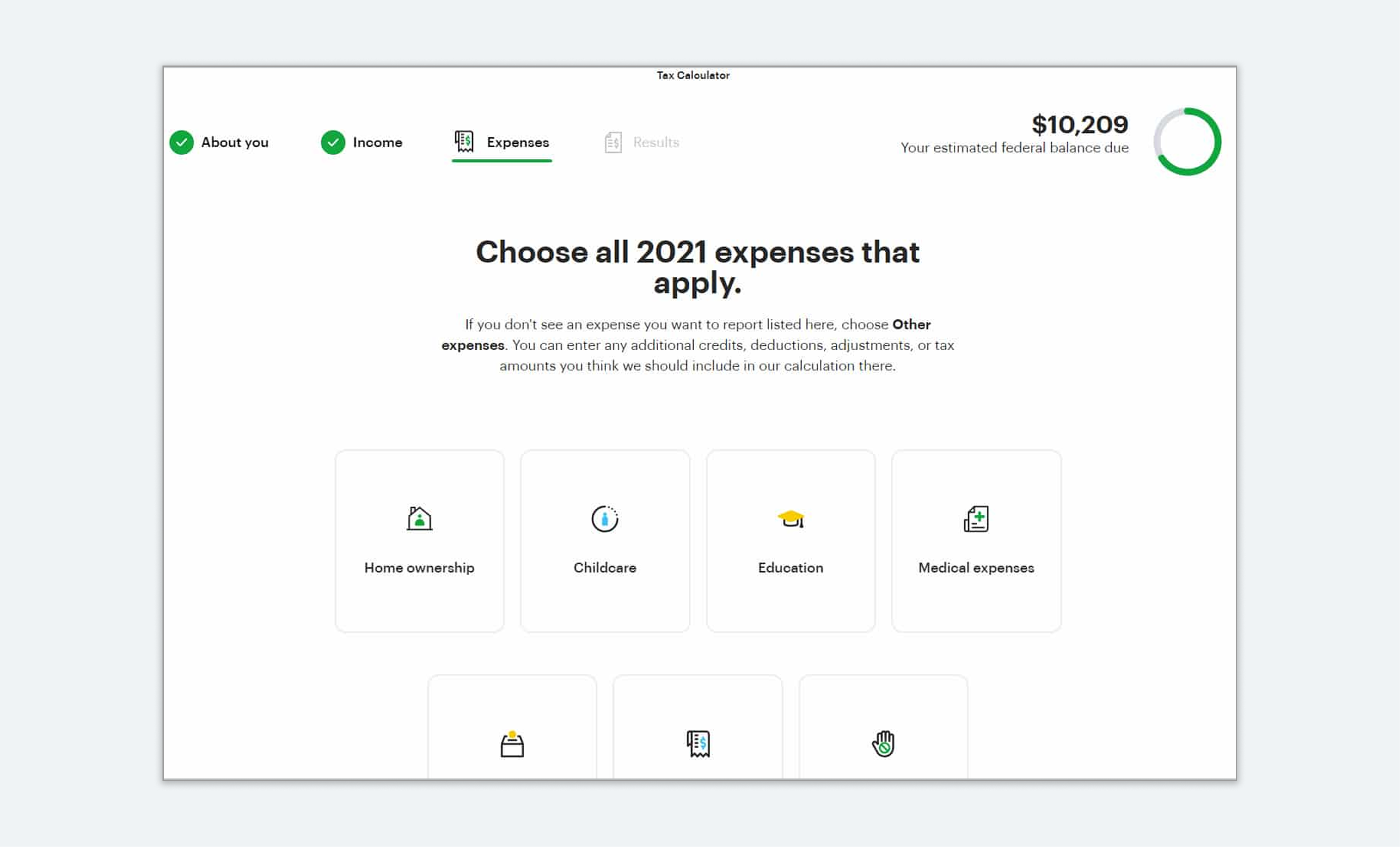

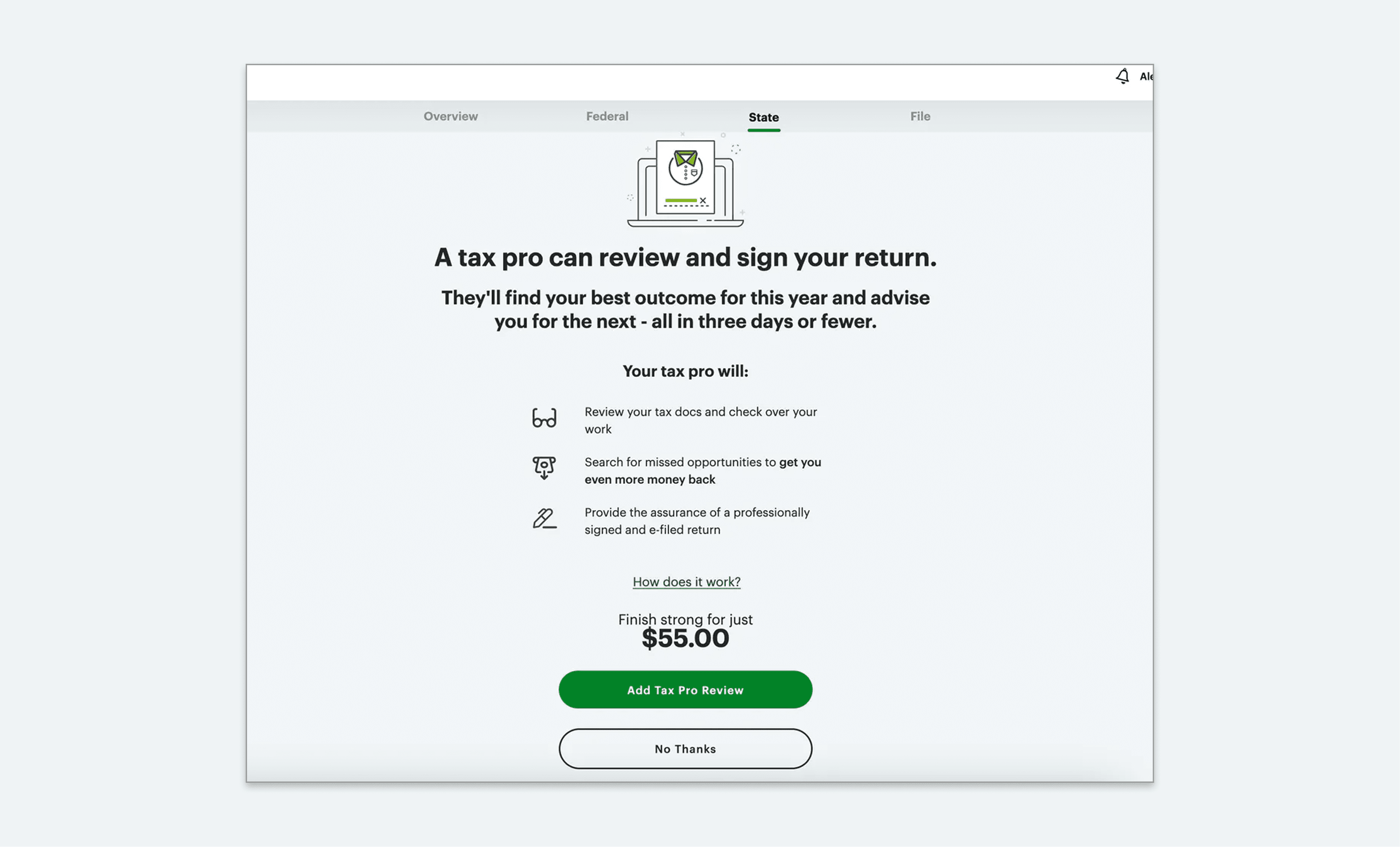
Screenshots of H&R Block for competitive analysis
First iteration: my individual approach to "submitting art samples" flow
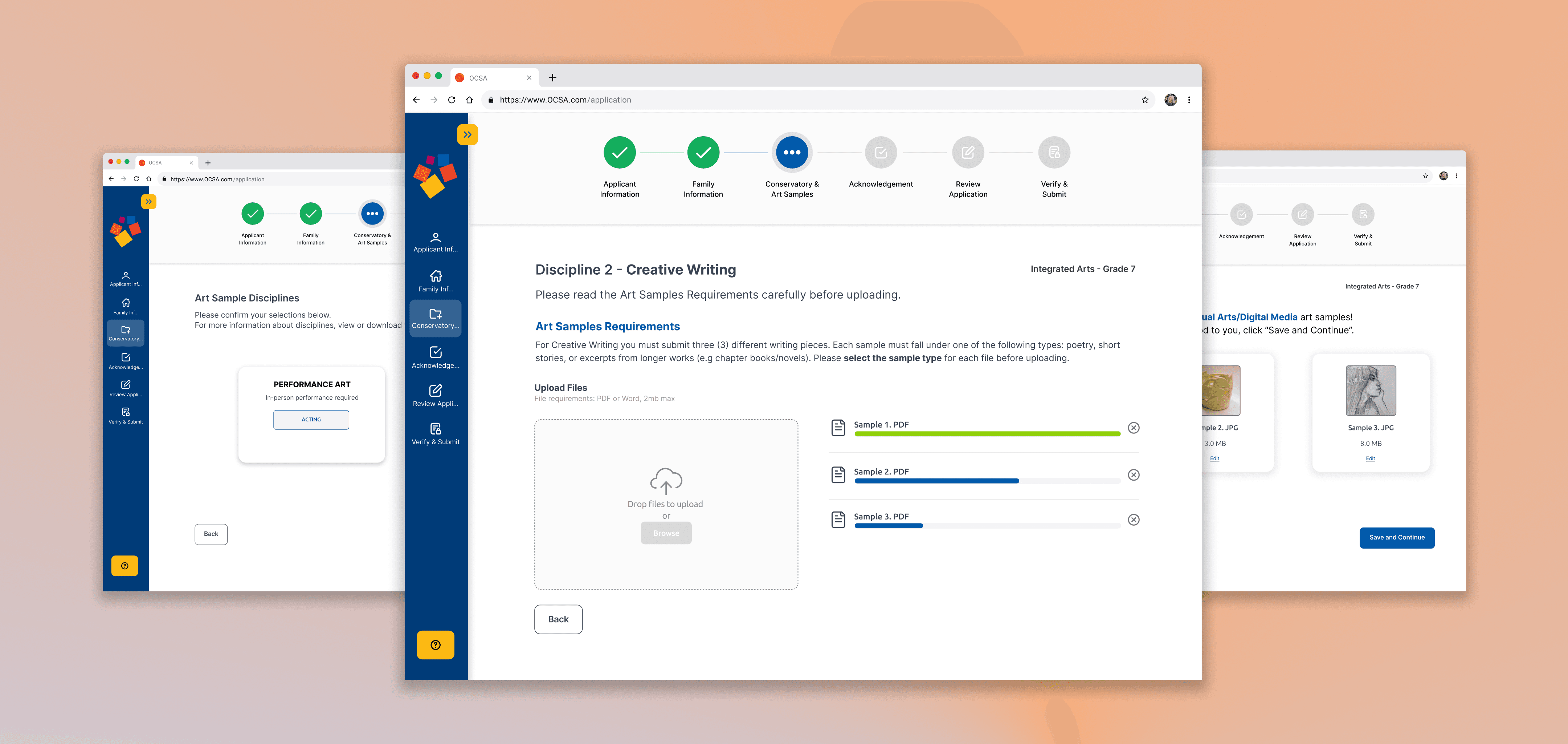
Each designer in our group was tasked with creating a low to mid fidelity first iteration of the redesign, integrating each of the design requirements above. I focused on the user flow of submitting art samples.
Before—Submitting a Visual Arts sample

After—Submitting a Visual Arts sample


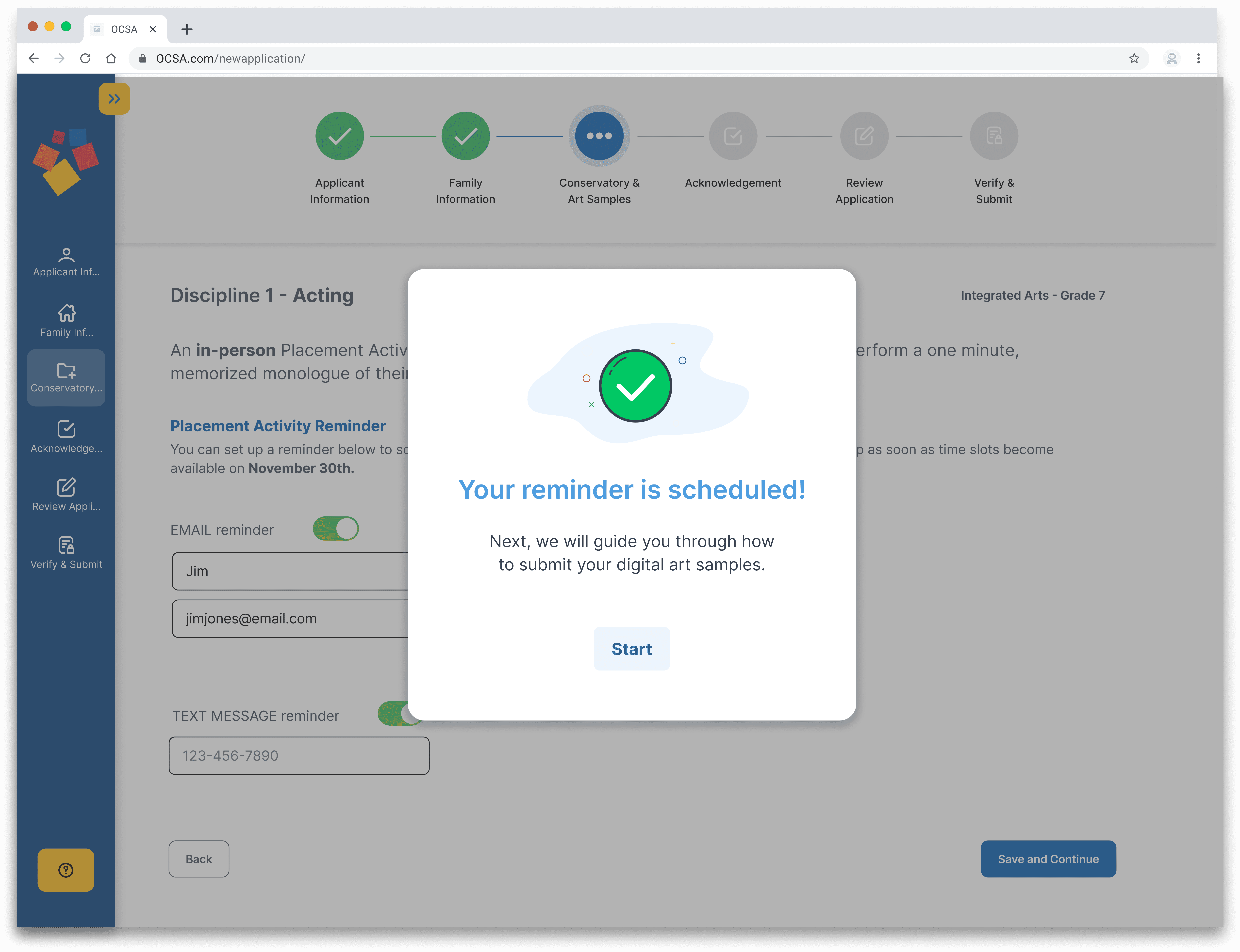
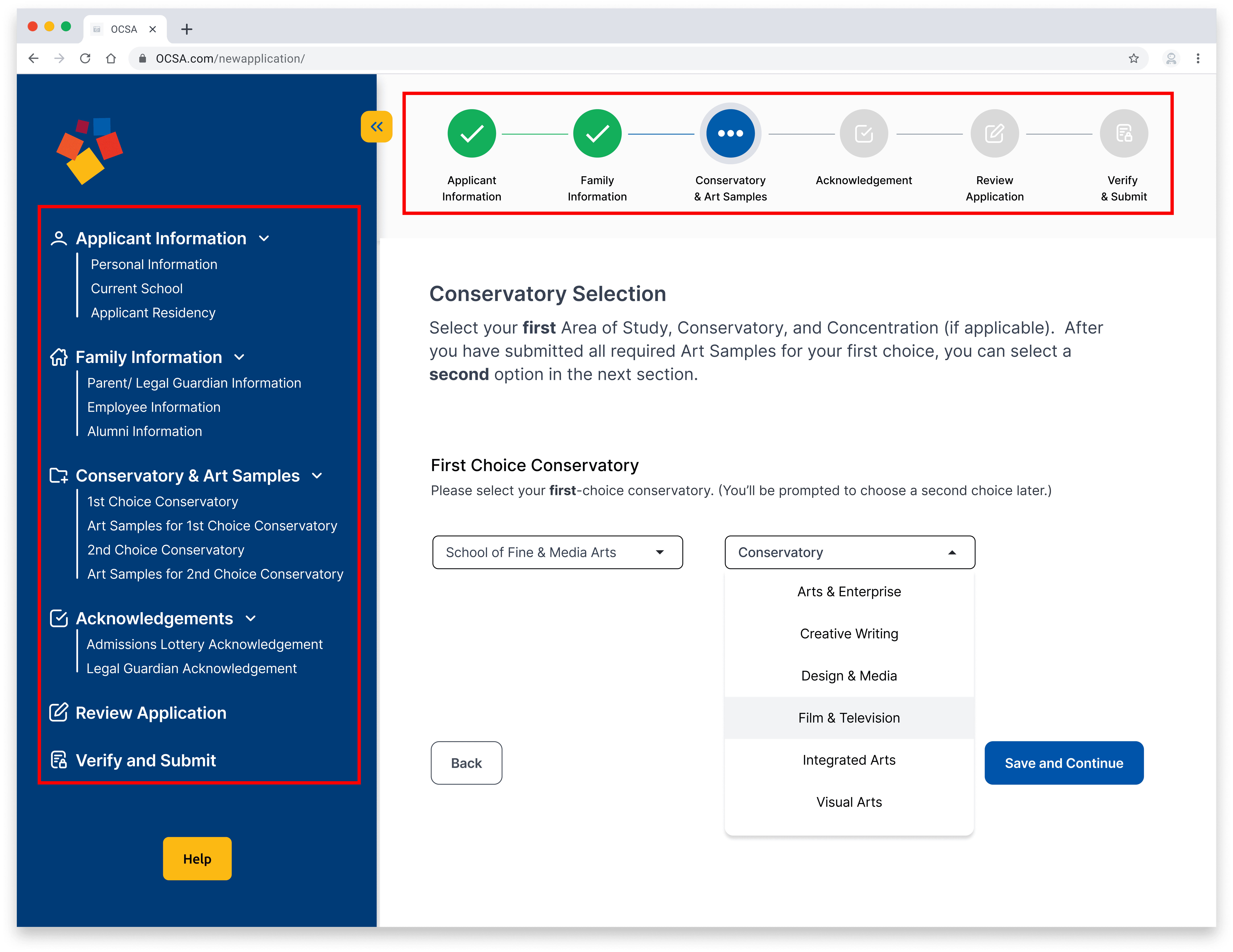
Stepper with labels lets the user see which sections of the application are complete, which section is currently in progress, and which are remaining to complete.

Detailed breakdown of all required steps in the current section. Brightly colored OCSA logo appears to the right of whatever task the user is currently working on.

The submission requirements and guidelines are explained in the application at the relevant time, ensuring all applicants have access to critical information.

The application prompts the user to self-identify which category their sample falls into, to help ensure compliance with application requirements and easing the workload of the application reviewer at OCSA.
Next iteration: Changing the design to meet stakeholder constraints and team input
📅 Schedule audition in the application → ✉️ Set email/text reminders to schedule later
OCSA stakeholders said that in-app audition scheduling wasn’t feasible during the application process due to strict timelines. We adapted by replacing the audition scheduling with email or text reminders for when staff would be ready.
Before—Acting audition scheduler

After—Reminder to schedule acting audition

🔄 Require individual file uploads → 📂 Upload multiple files at once
My team challenged my idea of separating each required art sample into separate pages because they felt that it required too much clicking and would slow down the user to a point of frustration.
Before—Upload one file at a time

After—Upload all the required files for each discipline on same page

Key wins from testing prototype with current OCSA parents
100% of testers liked the "set reminder to schedule audition" feature ✅

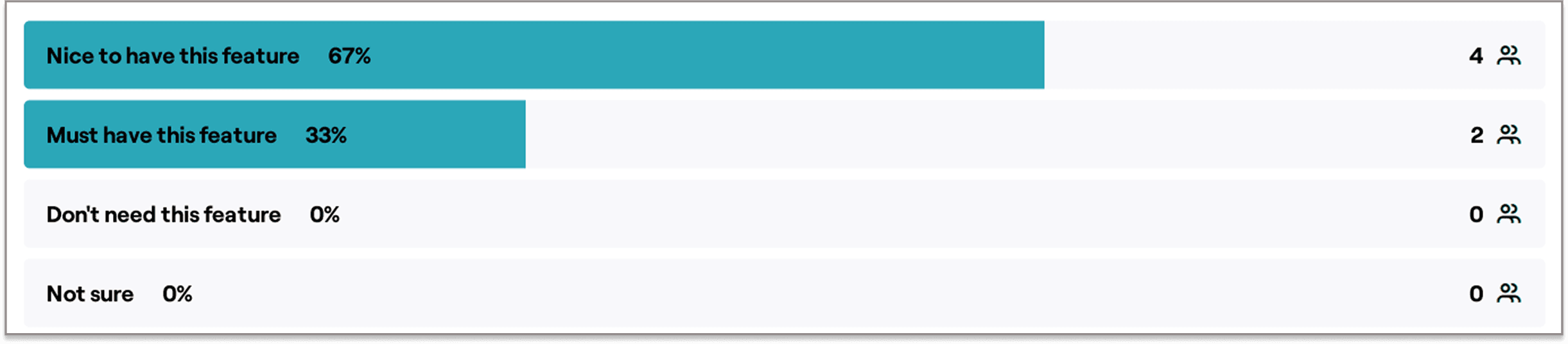
83% of testers found the details sidebar and the circle stepper useful ✅


100% of testers appreciated the modal that confirmed files were successfully submitted ✅


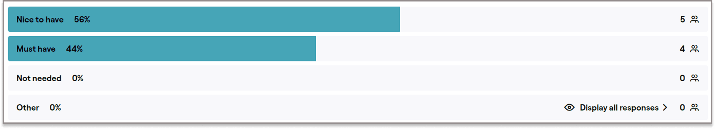
83% of testers said submitting art samples was “very easy” ✅


Opportunities for improvement from testing
⚠️ Incomplete prototyping caused some confusion when submitting art samples
Some dropdown options were not clickable in the prototype, leading to confusion for one tester.
⚠️ Unclear naming of the "Acknowledgment" section
The use of the term "Acknowledgment" as a section heading in the left info bar did not clearly communicate what the section would entail and how the tasks in that section are related.
Final thoughts
The final design not only improved usability, but also, if shipped, would reduce administrative burden, allowing staff to focus on higher-impact tasks. This project taught me the value of balancing user needs with institutional constraints and demands, and showed how thoughtful UX design can create meaningful change.

If I could go back, I would…
Make all prototypes more comprehensive, so that users are not forced into a very specific order of clicks, to reduce tester confusion and clarify test results.
Establish a KPI or metric early on in the project to place greater emphasis on how the redesigned application can serve business goals
Because we only had access to the original OCSA application for a couple of days at the beginning of the project, I should have done a screen recording going through the application rather than only taking screenshots for future reference.